Tuesday, February 28, 2012

February 27th
Jordan stopped in and suggested toning down some of the colors – “a little more mud,” he said.  He also suggested bringing Venus’ hair all the way across to the blue wave near the other face to unify the painting.  Just suggestions made by our valiant leader which I did not have time to work on today… maybe the next artist in…
Nan Fuhrman

Saturday, February 25, 2012

February 23, 2012
Today brought us back into the tower to  see the creative masterpieces done by our colleagues. Wow, so much has happened since we were here Feb. 9.  We changed the Sky to feel as if a wind has swept the valley of imagination. Being inspired by our childhood literature, we  created a valley in front of a mountain range, and added houses to the front of the painting.  Little Red Riding Hood has appeared and we felt she needed a village.  The steps on the right became houses with doors and the Greek architecture from the left side was mimicked on the right.  The whimsical heart tree and the balloon tree were left as sketches to add a touch of gentleness in an otherwise frightful dream in the sky.
Marylouise Roach and Madeleine Schaller

Mariana did such a wonderful job of pulling together a mystical scene.  I love the references to Santorini – a most magical and mystical spot!  The feeling I had on coming in today and seeing what has evolved was that we were drawing a dream so I turned the round shape at the bottom left into a little boy with his eyes closed.  I also worked on the shape at the far right.  The clown-like character actually scared me, so I softened it into another dreaming face.  At Jordan’s suggestion, I pushed the mountains back a bit.  I also added a moon as well as some moonlight on the caldera.  I like the two sides with stairways leading to and away from the center, but I think there is still room to distinguish the area in the middle – either by simplifying it or making it more unified or by making it more “dense”.  What fun it was to come back after a week to see how this panel had changed!!
Nan Fuhrman

February 23, 2012
I am delightfully haunted by the emerging mystery that is portrayed in this graphics/pastel construction.  My approach was to locate muted color and form in places that called to me.. as I got moving, I began to see mythological forms lurking about and around the human figures.  The lurking forms are prompting to move the distressed damsel toward the light and safety.  There is a tension between darks and lights – good and evil? – with the traditionally sly fox, perhaps, being the eyes of protection on the dynamic scene. 
And what is that developed city in the distance?  Is it a lost city that has been snuffed out by the more organic and grounded old fashioned small town, protected by castle and by church-like fortresses?
I’ve added color and shades in various places, and I turn to others to help balance shapes, darks and lights with the intensity they need to
finish out the story.

Ellen Pechman 


Tuesday, February 21, 2012

February 22nd 2012
Parvaneh Limbert, Ann Bolster, and I work independently using blues and greens, reds and purples, and yellows and oranges. We continued to strengthen the colors and texture thru out the painting.  We felt the painting needed to be lightened in the right hand corner to give a sense of movement upward in the ocean.  We work on Venus hair and feel that the next artist should extend the hair tendrils into the curvature of the waves going to the right side of the painting in order to unify Venus with the whole of the painting.  What a nice opportunity and challenge we had working together on the painting.
Becky Salzinger

Sunday, February 19, 2012

Thursday, February 16, 2012 Happy Birthday Jordan!!!
Wow!  What a dynamic and colorful piece this is becoming!  I like its diagonals and the variety of shapes (both geometric and organic) as well as the many colors…at the same time, it felt to me that we needed some “muting of color” in some places, to make the remaining bright color stand out. 

The more I thought about it, the more I realized that it needed a bit of depth.  An under water scene to me, conjures transparency (it does not help that I just returned from a vacation in the Cayman islands where the snorkeling was spectacular).  To that effect, I began to draw some “wavey” shapes with just chalk and a bit of pastel (can be removed).  My idea was to photograph before and after and see if I liked it, before committing to acrylic glazing to “veil” some areas and to add or render some shapes with softer edges, to create the illusion of things being “in and out of focus” (=>depth).  But I ran out of time working on the monochrome piece instead.  Next time, if I still have this impression after examining the progress of this colorful piece , I may try to execute that plan.  Of course, someone might have done it by then, and it is great, either way.  Enjoy very much and thank you all and to Jordan for this opportunity!  Have fun,
Mariana Kastrinakis


Friday, February l7
The painting certainly changed today.  Overall, we felt the orange and yellow needed to be toned down and to integrate the right side with the left.  Because of the one face we decided to insert Botticelli’s Venus.  The bottom right side was tweaked a little to exaggerate the wave and continue the fish up to top.  We would like to keep the Venus that Joan worked on so beautifully. We had a lot of fun today and will be very interested in seeing what happens next.
Marian MacKerer, Carol Bouville, Joan Mazer

Saturday, Feb. 18
Joan Mazer here again! I continued changing the colors to suit the mood of the sea as I experience it in my head. Observing the work I did today, I realize that there are still a lot of shapes that could emerge further from what is currently on the surface but that it was much more fun working with other artists present. On the other hand, a lot of people came through the gallery and commented on the color scheme!(?)

Saturday, February 18, 2012

Thursday, February 16, 2012:  Happy Birthday  Jordan!!!
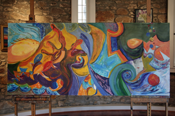
I was immediately struck by how strong this piece seemed to be becoming: the monochrome scheme gives it power and the elongated horizontal “picture plane” makes a powerful statement.     The challenge is to link, in some way, the multiple representational shapes (wolf, hands, monster, vines…) which are all beautifully rendered.
After some reflection on the overall composition, I thought that it needed a stronger top half of the picture.  Since I could not quite “turn it over”, as we do sometimes, to evaluate the design upside down, I took a picture with my camera.  I was able to look at that upside down.   It confirmed my suspicion that the top half seemed not to be anchored nor related strongly to the rest of the painting. 
As I began to think about a solution, I thought about a high horizon, as if the viewer is looking down (following the tracks of the person who was inspired by the “Cannes rooftops” motif). 
I then realized that adding a high horizon to this dreamlike composition reminded me very much of the island of Santorini, in Greece.  I went to the web and found some images that inspired me to include some geometric rooftops and stairways.  (for your information, see desktop file I created called “Santorini”). 
I traced a high horizon with a loose rendition of the opposite land mass that encompasses the border of the “Caldera” or the ancient volcano center that is said to be buried under the deep sea of the Cyclades.  The Island is unbelievably beautiful and very dramatic, as it rises out of huge elevations and dips of terrain of mixed rock and volcanic soil, the latter is largely black.  Its buildings and inhabitants are perched on the arbitrary ups and downs of the terrain and stairs RULE everywhere you go.  It is the perfect “workout” island!. 
But Santorini is also a mysterious island, standing  alone in its configuration among Greek isles and considered unique and “different”.  The latter possibly fueled  much of the historic  and religious lore that surrounds the island.  It is said to have been inhabited by and vampires who supposedly thrived there after being “banished” from cities.   One has to wonder if the large number of Santorini churches one sees is related to such beliefs. 
See if you think this is a fitting notion to inspire us towards the finish…
                        
On the technical side, the areas of the painting with powdered graphite lend themselves to absorb almost no other medium on top…since the gesso surface is saturated.  I found that working patiently with some charcoal/pastels would allow some darkening  but not enough to get the value needed.  I had some more success working with a bristle brush and water in smoothing out some areas that appeared almost “scratched” by the pastel or charcoal.  We also need some white of a kind that is “reversible” like white pastels (we have only 5-6 tiny pieces), white gouache or casein or even permanent white (or Chinese white) which is similar.  I will try to bring some next time.  Our alternative is to do gesso, but I did not want to start using an acrylic on this surface.  But you are welcome to differ and do otherwise, the most important thing is that it was fun!
Thanks very much to Jordan and all of you!
Mariana Kastrinakis

Wednesday, February 15, 2012

February 13, 2012
I added some “fur” to the wolf.  I wanted to balance some of the sienna color from the middle of the drawing.  Then, I had to think…  wolf… hunter… eerier looking woods… little red riding hood!  So, she appears running from the woods to what she thinks is Grandma’s house… but it is in another house…  oh well… a little more fantasy to this piece.  I then looked at the other side of the panel which was pretty bare.  There seemed to be a theme of “hands” developing, so I added one on an arm to “hug”.
-        - Nan Fuhrman

February 13, 2012
I guess I needed to soften some of the colors.  I did that up in the right upper corner and I tried to bring in some more blues to the top edge.  The bubbles feel lighter to me now.  All the yellows took me away from the sea, so I felt the need to contrast the yellowy waves with blue background.  Sorry, Joan, I began work on your face…just a little.
-         Nan Fuhrman


February 14th , 2012
Becky and I went for balance and connection in the colors. In general, we felt the painting needed more blues, greens and purples, but we also like the excitement and surprise of red so I enlarged the ball and deepened it’s red. I also added more red to the fish.
Becky added a mouth and eye to the large fish and continued the wave to the lower right of the canvas. We worked a lot on the waves, giving them more depth and we would like to see more purple in the canvas. We had a lot of fun and look forward to seeing how the painting changes when we return next week.
        Ann Bolster and Rebecca Salzinger


Monday, February 13, 2012

February 12, 2012

I was so excited to participate in this collaborative effort to be able to work together with other artist and cannot wait to see how this painting evolves and how we “resolve” it.
As I came back to the Stone Tower where I was the Artist-in Residence twice in the past two years, the task was different… I had in front of me 2 panels others started to work on, and I had to react to it. 
My plan for today was to work with color rather than on the graphite painting. The dialogue begun when the first challenge was to get into the mood of the painting. The geometrical shapes had movement, but were too “hard edge” for my style of painting. The panel was still with lots of unpainted areas. I realized that I needed to paint in order to eliminate the “white spaces” in order to understand more of what is in front of me. With a big brush at hand, and intermittently using a long palette knife, I felt that I added some vibration to the painting and my own style.
I felt comfortable with the size of the panel since I also work on large scale paintings. I can’t wait to continue the work using oil paint as well.
This has been a challenging and a wonderful new experience for me.    
Edith Sievers

Sunday, February 12, 2012

February 11, 2012
It takes a lot of paint to cover this panel!  I’m not used to such a large scale.  Even mixing paint was a challenge.  I hope you all like bold colors.  My favorite part is where the brown/orange coral meets the dark purple, so try to leave that area alone.  Otherwise, go to town.  This is a lot of fun, anyone not participating is missing out.
-Debbie Wallace

Friday, February 10, 2012

February 9,2012

Wow!  The Sea!  We were inspired by the orange and added more color and free form organic shapes.  The painting needed grounding so we added a piece of coral to take the focus away from the center. Mixing “mud” we helped to create more depth to the painting.  We can’t wait to see the additions when we return at the  end of the month. Enjoy!
Madeleine Schaller and Marylouise Roach

February 9, 2012
Madeleine Schaller and Marylouise Roach
We began our creative process by admiring the wolf on the top left.  We  become representational and then quickly decided that abstraction was the way to proceed. We moved the center focus more to the left and progressed from the existing face to a flower pot to the current abstraction.  The top left windows need some warming up, so the moon appeared and the fish fell out the window.  Whether or not this tells a story is up to your imagination.  Good luck, have fun!

Thursday, February 9, 2012

Wednesday, February 08, 2012 
Hi, I’m the next artist.  I looked at the drawing as if it were a Rorschach test, and let it speak to me.  Wanting to bring out spatial depth, contrast, and negative/positive space within the vast expanse, I tried to drive a feeling of whoosh and movement across the “sky” above the hint of horizon, to start

horizontally unifying the composition.  Tried not to let it get too weird, but I did put in the tiny people, the fish, the hands, and I made the “cloud” a “creature.”  The left wave of existing tone suggested a wolf to me. Drawing him suddenly felt primal. I was at one with the cave painters--and with Marc Chagall!  Who knows if cave paintings were individual or group efforts, but welcome to our local, mystical cave!
– Nancy Abeles

Wednesday, February 8, 2012

"The Sea"
Tuesday, February 07, 2012 – Nan Fuhrman
I have added a few bits of color (since Jordan wanted this panel to be in color) just to get color going.   Feel absolutely free to undue what I have done!!

Tuesday, February 7, 2012 – Ellen Pechman        
I’m doing my usual pacing around in search for an idea, feeling a great deal of trepidation anticipating drawing on huge canvas that already have on it other peoples’ work.  I especially enjoy Joan’s insertion 


"The Sky"


Tuesday, February 07, 2012 
I wanted to add mood to Debbie’s “bones”.   Using powdered graphite and erasers, I darkened the sky in the West, added another cloud and then provided some dimension to another cloud.  The panel is so large that I felt the need to cover ground quickly. Then, I decided it might be better to leave the Eastern sky alone so that someone else could bring his or her perspective to the time of day and the weather.  I find using powdered graphite for drawing to be exciting and expressive.  It has really loosened me up as I approach my work these days.  Thank you, Jordan, for giving me this tool!!

 – Nan Fuhrman

Tuesday, February 07, 2012 
I picked up where Nan left off this afternoon.  Inspired by work I found in this fall in Berlin from French art nouveaux/cubist painter, Jean Lambert-Rucki  (1888-1967), I felt the urge to add a touch of humanity and humor (hopefully it is seen as humor) into the sky space.  I then built off the angles of what felt to me to be buildings, added further lines and angles and a stairway to the sky (off to the right).  In the sky, I got a kick out of playing with the waves of graphite as I explored the darks and lights of the space and of the medium.  I found of interest that the different tools and media that I used – graphite, charcoal, pencil, and compressed charcoal—all responded in entirely unpredictable ways to the wood canvas we are using.  In the end, I am not sure where the work is moving, but I certainly became absorbed in the forms, darks/lights, and flow of the working process.  Not a bad start.  I look forward to seeing where the next artist takes this.

– Ellen Pechman

Monday, February 6, 2012

Sunday, February 05, 2012
Starting out on this huge panel is very intimidating, but I gathered my courage and gave it a shot!  I went for a composition with strong diagonals to lead your eye across the panel.  I loosely borrowed building shapes from “View of Cannes, Evening”.  The composition is very simplistic, but I think as we all put in our different style, the simplicity will be an advantage.  If anyone has a more inspiring way to start, I will not be insulted if you want to start over.  Have fun!    Debbie 

Sunday, February 5, 2012
Thanks for the great start Sara.  Since both of our styles are very geometric, it was easy for me to expand on your shapes.  I tried to introduce some depth and more pattern.  I think artists with a softer style will be able to add subtlety once we get into the painting phase.
    
 – Debbie Wallace


Monday, February 06, 2012
I’m a realist painter by nature and so in thinking about what I wanted to add that was personal, I drew my face in a distorted style, so far, just in pencil. If I get to paint it, I think I’d do it in shades of gray to contrast with what I think the rest of the canvas will look like. It’s a little disconcerting to have such a huge canvas facing me. I’m curious to see how everyone’s palettes will blend OR NOT! 

– Joan Mazer


Sunday, February 5, 2012

The Collaboration Journal

The Collaboration Journal
Friday, February 3, 2012
It was great fun starting off the collaboration today.  I’m excited to see where we go from here. The evolution of the design will certainly grow to a work of great dimension.  Feel free to enhance the fish realistically or take it out altogether. Enjoy!
- Sara Becker


Saturday, February 4, 2012

A Letter from the Organizer

Here we are again!  It’s February, so it’s time for our Yellow Barn Collaboration!  Last year the Yellow Barn Instructors banded together to collaborate on some pretty awesome artworks.  We created three paintings over the month of February in a relay fashion with each instructor adding their personal touch to the artwork.  This time around, I’m leaving it up to my advanced students!  We’ll have two LARGE panels (72x30”) to work on for the month, one incorporating drawing media, the other paint.  The progress will be posted here daily so check back often! 

Our artists will also be keeping a digital journal, writing about their experience with working in collaboration.  They will be writing notes to their comrades explaining their choices, if they do not want anyone changing what they were working on, and if they would like future artists to embellish their work.  This is about community as much as it is about collaboration. 

As collaboration organizer, I will periodically be suggesting themes, approaches and possible directions for our 30 artists to work in, but will no way work on the paintings and drawings. 

If you would like to see the art in person, the Stone Tower 1st floor will be open daily from 11:00-5:00pm. 

We invite everyone to follow our progress and if you have suggestions for our collaboration, please send an email to Jordan@jjbruns.com.  I’ll pass the suggestions on to our artists and maybe even post them in our digital journal!

Thanks for reading!

-Jordan Bruns
Studio Manager of the Yellow Barn Studio and Gallery